Wall plotter update #9: calibration and testing + Mother’s Day print
Although the semester officially ended last week, I find myself making more and more rapid progress on my wall plotter – funny how that happens sometimes! This week I found the cause (or a cause) of the distortion issues I mentioned in my previous post, and relied on my intuition to test out different ideas to try to correct it. Today, I was able to zero in on a pretty acceptable level of accuracy; not great by any means, but good enough to create some quirky prints.
Main cause of distortion, with solution
Last week I tried to create a few prints manually by sending individual commands to the plotter myself, and noticed a pronounced and consistent distortion affecting the horizontal axis of all the lines. In other words, everything I drew had a pretty predictable downward curve to it. The interesting thing about it was that the starting and ending points were actually pretty close to where they should be, but the path taken between those points had these downward curves.
My first guess was that the numbers I used to define the center of the canvas in the bot’s code were either too high or too low, so I went ahead and re-measured the actual values on the plotter, rather than relying on my spreadsheet. There did indeed turn out to be some amount of error in these numbers, but it didn’t seem huge to me. I corrected the values and re-ran the same tests. Same results.
I posed the scenario to the creator of the project I’m relying on (Der Kritzler), and he suggested that in fact the software may be causing some of this behavior. When you tell the bot to move to a new point, it has to do a little bit of math to figure out how to actually spin the motors to get the pen to that location. Somewhere in this process certain approximations are made, using a technique called linear interpolation. From what I understand, given two points in space, one can use interpolation to find any intermediate point along that line. I have heard the term “interpolation” before, but I’m still not 100% sure I understand it’s use. Obviously it is extremely useful, but its one of those abstract concepts that sounds really vague and general at first, but is ubiquitous in its usefulness.
Alex, the Der Kritzler author, recommended that I try to break down large lines into many small lines, which is what his Processing code in fact does. By doing so, the downward curve between the points becomes nonexistent and the distortion should get better. In other words, using his Processing code should help!
Dialing in the accuracy through experimentation
I started by creating a simple SVG file with a single square inside of it, centered in the canvas. I fired up the Processing code and started the process to break it down into instructions and send them off to the wall plotter, then observed the results. Pretty quickly I realized that there were some pretty unintuitive differences between the coordinate systems of the Arduino (hardware) side and the Processing (software) side. Basically, although you can find variables with the same name (such as START_X and START_Y) in both the Arduino and Processing code, they are not meant to be the same. In fact, they both had different ideas of what “center of canvas” means. This was a little annoying, but because you can actually move the contents around the canvas in the Processing app very easily, I was able to keep moving the little square and plotting it over and over again until I found the actual center of the canvas. I then updated my SVG file and code variables to reflect the actual values and now the pen carriage doesn’t go fall off the edge of the canvas anymore.
Here are a couple of prints I produced where I printed a single square, then moved the canvas a bit and printed again, until the square was drawn at the actual center of the canvas in real life. Once I found the center, I wanted to see how the plotter handled circles, right angles and diagonal lines, so I made an SVG file with a little bit of each and let it go. As you can see, there is a little bit of distortion, but not nearly as much as before!
[flickr-gallery mode=”photoset” photoset=”72157629687256866″]
Experiments in pen carriages
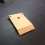
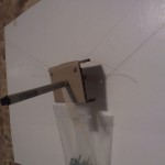
While dialing in the accuracy and finding the center of the canvas experimentally, I noticed a consistent error popping up in every print. If I try to plot a closed shape like a polygon or circle, the ending point always ends up being lower than the starting point. In other words, the shape never gets closed! I’m investigating the cause of this right now, but I have a hunch that it is related to the design of my pen carriage. Maybe it is, and maybe it isn’t, but building a better pen carriage can’t hurt, right?
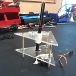
I started with a carriage I built out of plexiglass and some nuts and bolts. It looked nice, but I wasn’t sure if it was working the way I intended it to. I decided to try to get a better intuitive idea what matters and what doesn’t by iterating through simple designs and tweaking one thing at a time. I’m still building carriages and testing them out, but I wanted to push out this update in time for Mother’s Day, so I’m going to just show what I’ve done so far. Plus, I ran out of paper, so there’s not much I can do today anyway :P
Happy Mother’s Day!
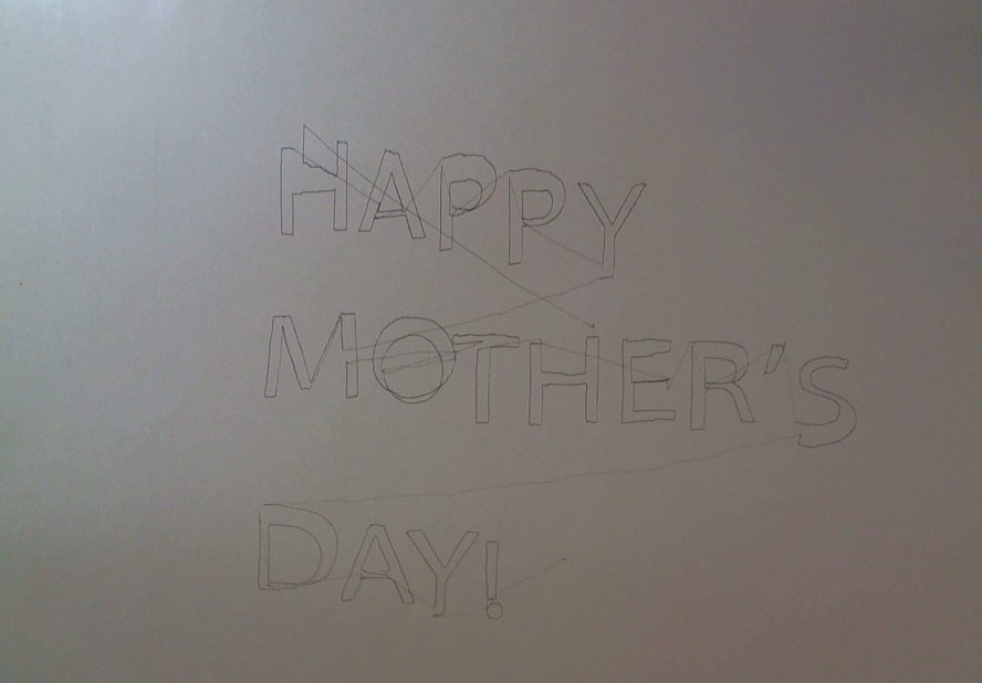
Eventually I was able to get consistently decent enough accuracy to print something more than a single line or box, so I wanted to make a slightly more complex print. Since today is Mother’s Day, and I’m not really a card or flowers kind of person, I had my plotter create this print for my mom. The accuracy is good enough that the text is legible, though its not going to be doing any super fine details just yet :)


